Tuesday, August 9, 2011
boy
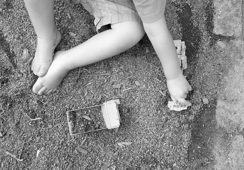
all day in the dirt.
in his hair, under his nails, smudged on his face, in his pockets, sometimes in his mouth.
summer is pretty good to him.
on an aside, i took these shots with the fuji finepix x100. i used the monochrome+R filter in camera with almost no post processing ( i think i upped the contrast a smidge in two shots).
i have been really happy with the x100, but have been reading mucho discussion over the camera *slowing you down* which for some is a good thing in terms of taking your time with your photos...and for others is just an excuse for a less than stellar menu set up.
personally? i like the camera.
a lot.
i do not regret my purchase one bit for many, many, many good reasons.
but.
i am annoyed at one thing.
the buttons are a pain in the ass.
i know, i know, small buttons? what the hell? get over it. you have a beautiful camera, something really special and you are going to complain about the button size? i KNOW. i should shut up.
but.
it turns out that i shoot in macro mode most of the time, so this is an issue. if i hit the flash suppression button one more time in the place of the macro button? i may flip.
there are shortcuts galore for the camera...but i can not remember all of them. yet.
i will though, because as much as i like to toy with the concept of slowing down my way of shooting, to take more time with composition, to fully embrace the richness of what a range finder camera has to offer ( and yes, i know, it is a hybrid range finder, but you get what i mean)...um..my life? my subjects?
they are not slowing down for me and my cute little retro styled camera.
(and it is something nice to look at)
i think what will happen is that people will develop their *way* with this camera. that no two people will use it in exactly the same way.
this camera is more than able to give me what i need from it. but damn i wish the buttons were bigger;).
or that my fingers were smaller.
Subscribe to:
Post Comments (Atom)


2 comments:
buttons are controls. control is what you need. they should always be first and foremost, so bitching about them is totally valid. you can have the most amazing, beautiful, fantabulous piece of gear in the world, but if the UI sucks, you'll never get the most out of it.
I've heard this complaint a lot, and it's generally what happens when the engineers make human interface decisions. or harper.
My problem is the Okay/Confirm button... that button is WAAAAY too small for my ham-hands.
It'd be nice if Auto-ISO was moved into the ISO selection menu à la Canon.
And I wish I could use the RAW button as an ND toggle.
Post a Comment